1. 2023 Bull Market and BTC ETF Approval
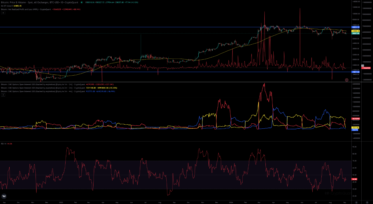
In 2023, the Bitcoin market experienced significant growth, with an accompanying surge in CME options open interest (OI) as market participants increased. During this period, investor interest in Bitcoin reignited, leading to a clear uptrend in OI.
Subsequently, the approval of a BTC ETF in 2024 brought even more institutional investors and new participants into the market. As a result, OI in the CME options market surged, greatly enhancing liquidity in the Bitcoin market.
2. Profit-Taking in March 2024
In March 2024, Bitcoin briefly reached a new all-time high, after which prices entered a correction phase. During this time, the Net Realized Profit and Loss (NRPL) data showed that many investors were realizing profits, leading to a significant spike in NRPL. This indicates that in March 2024, many investors took profits, which temporarily increased selling pressure on Bitcoin.
3. CME Options OI Sustains Higher Levels Compared to 2023
Despite entering a correction phase after March 2024, CME options OI continued to remain at levels higher than those seen during the 2023 bull market. Typically, OI tends to decrease during price downturns or corrections, but during the 2024 correction, OI has remained at relatively high levels. This suggests that market participants still maintain a bullish stance on Bitcoin and are holding their positions.
The strong bullish sentiment regarding Bitcoin’s long-term outlook can also be inferred from the fact that OI has not fallen back to 2023 levels, indicating that confidence in the market remains robust. This implies that participants are likely positioning themselves in anticipation of the next bullish cycle.
Conclusion
Beginning with the bull market of 2023, the approval of a BTC ETF in 2024 had a significant impact on the market. In March 2024, Bitcoin saw a wave of profit-taking, with N

View original →Bullish(Nuanced)BTC
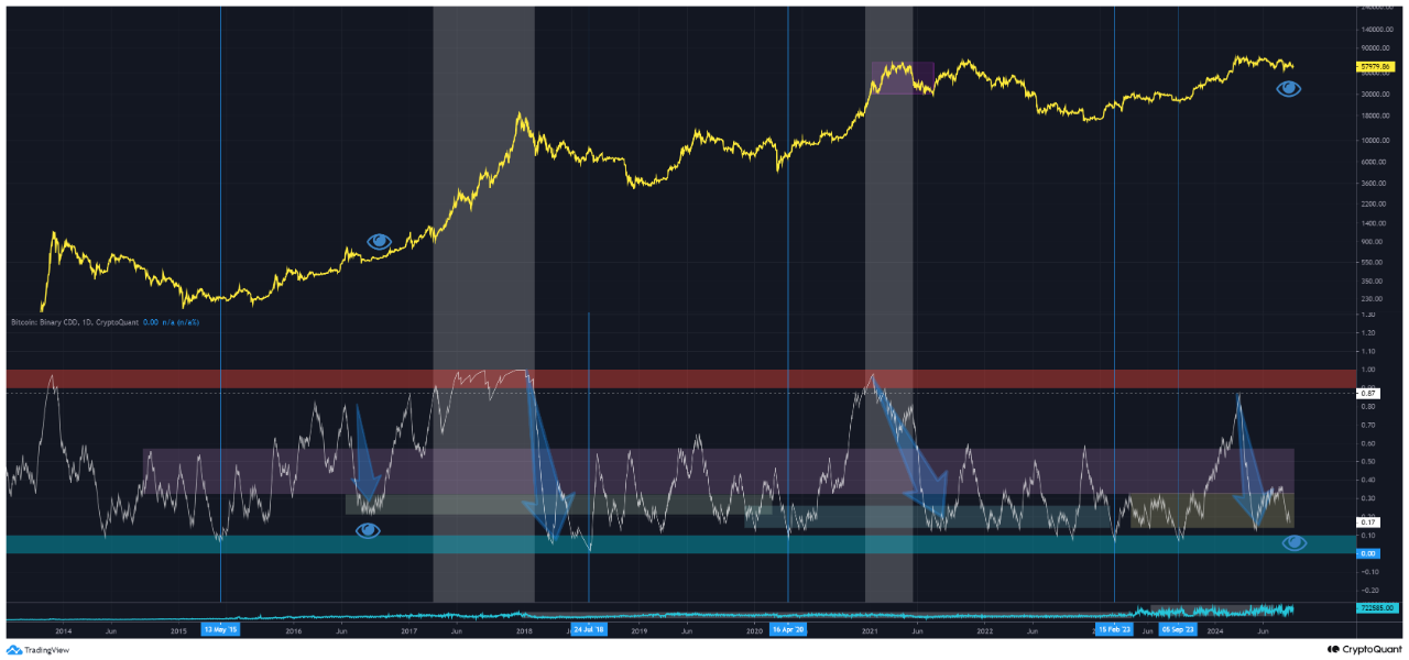
9/5/2024 In March 2024, Bitcoin reached a new all-time high, leading many to question whether this marked the final market top. However, based on on-chain data analysis, it appears that March’s peak was likely an "initial top" rather than the ultimate one.
Looking at Binary CDD (Coin Days Destroyed), a key indicator of long-term holder activity, we can see that long-term holders did engage in profit-taking around March 2024. However, a crucial point to note is that Binary CDD has not yet reached the red zone, a level it historically hits before the final market top is reached. This suggests that there is still room for further upside in the market.
Moreover, current data shows that long-term holder activity is not particularly strong right now, and selling pressure from long-term holders has decreased. The absence of large-scale selling by long-term holders indicates that the market has not fully matured, and we are still far from the final peak of the bull market. Thus, while March’s high may have been an "interim top" that led to a temporary period of consolidation, it is not yet the ultimate peak of the bullish cycle.
The market appears to be in a "cooling-off" phase, adjusting both price and time. Once this phase concludes, another upward movement could follow. Before we reach the final top, we will likely see renewed activity from long-term holders, with Binary CDD reaching the red zone, signaling the next round of price adjustments.

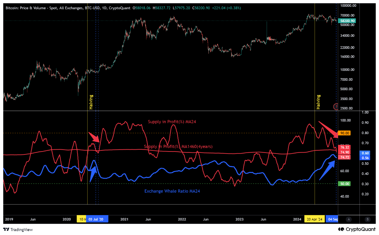
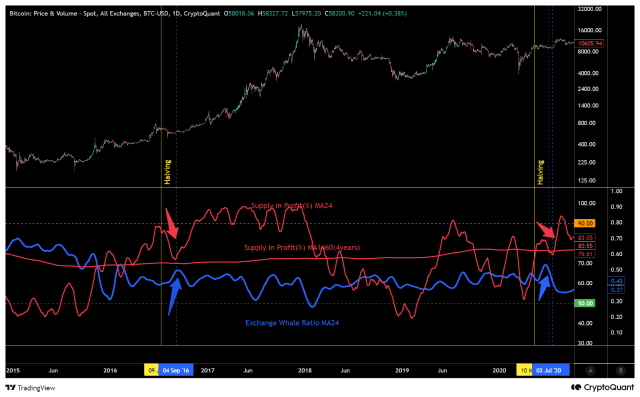
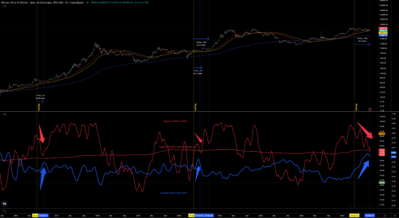
View original →Suplly in Profit (%) and Exchange Whale Ratio after half-life.
an interesting trend can be seen.
As the half-life comes to an end, the influence of miners gradually declines, and by 2024, BitcoinETF is launched, etc,
The influence of the price is more dependent on the Bitcoin ETF and CME in the U.S. market, rather than the influence of the exchanges, but it is an interesting trend to keep in mind.
Keeping in mind, the behavior of the whales of the exchanges is more informative than the behavior of the small caps.
Therefore we have to think about the 4 -Year Moving Average.
About the 4-Year Moving Average
The reason a 4-year moving average of price acts as support is that it shows the average trend of the market over a long period of time and market participants are more likely to recognize it as a significant level.
If we were to introduce a 4-year moving average for Supply in Profit (%), this would indicate “how much supply the bitcoin market has profited over time.
3. 4-year moving average of Supply in Profit (%) may provide support
MARKET CYCLE: The 4-year moving average could serve as an important level in the Bitcoin market cycle. For example, if Supply in Profit (%) is below the 4-year moving average, this is a phase of significant market losses and based on historical trends may be considered a rebound.

View original →When will the price adjustment occur and how will the ceiling zone be reached?
These are topics of great interest to us at the moment.
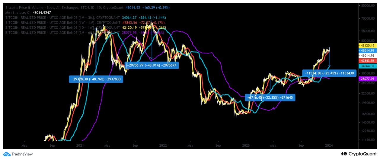
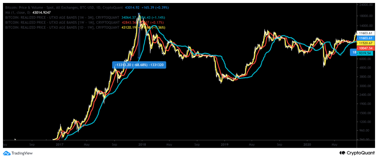
It is a well-known fact that the price of BTC has been rising due to expectations for the approval of an ETF for BTC and ”HALVING” that is expected to arrive in April of this year.
As these fundamentals are factored into the price, a divergence between the current BTC price and the Realized Price - UTXO Age Bands will occur.
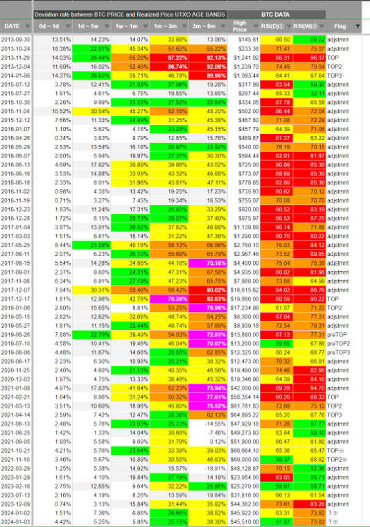
While we could draw the rate of divergence on a graph, we have created a document that will help you identify price adjustments and ceiling areas by looking at ”Deviation rate between BTC PRICE and Realized Price UTXO AGE BANDS” and ”BTC price RSI"
The table is colored intuitively like a HEAT MAP. By judging the difference between the TOP and the current price, it is possible to determine that the price is not yet in the ceiling zone. However, it is the ATH of November 2021 that troubles us the most. The area marked with an asterisk (*).
The price here seems to have been made by CME.
We also believe that the current price increase is also price formed by the CME.
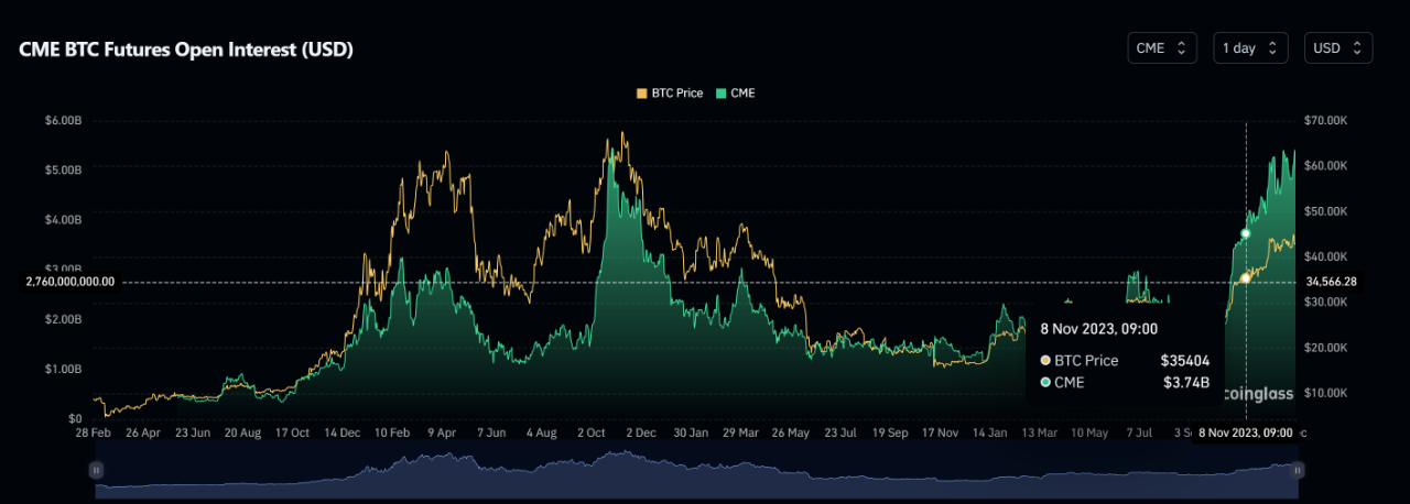
The basis is the CME's Open Interest.
(From Coinglass below)
CME Open Interest
5.46B as of October 26, 2021
As of January 4, 2024 5.42B
The CME Open Interest on October 26, 2021 and today are almost the same level.
Therefore, it can be judged that the divergence in the * area is as heated this time as it was on October 26, 2021.
So, is now the ceiling area? Perhaps we should pay close attention to the price movement from the previous day when we know whether or not the ETF approval will be granted, and next we will be interested in the rate of decline after the price adjustment with a temporary top before ”HALVING”

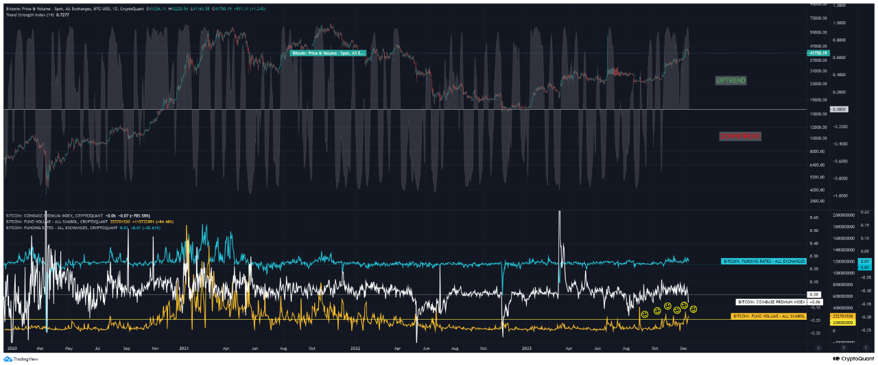
View original →An indicator of the strength of the trend against the price is displayed in the background of the price. The indicator indicates that the daily trend has not yet broken, although there has been a sharp drop in prices.
Looking back at the driving forces behind the recent price movements,
The Funding Rate was at a relatively low level (data not shown here) when physical buying (increase in coin base premiums) led to a sharp increase in OI by large BITMEX customers through market purchases, causing short-covering and a rise to 44K. The large BITMEX customers soon took profits, and when the Coinbase Premium declined and the profit-taking progressed, the FR rose to nearly 0.02, and longs liquidated, leading to the current situation.
Now, one of the interesting, but unnoticed, points is that FUND VOLUME exceeded the 200,000,000 threshold that the author has designated, even during yesterday's sharp selloff.
As long as the FUND is buying up bitcoin, even if a time adjustment progresses, the market environment is unlikely to lead to a major decline because the FUND may support the purchase.

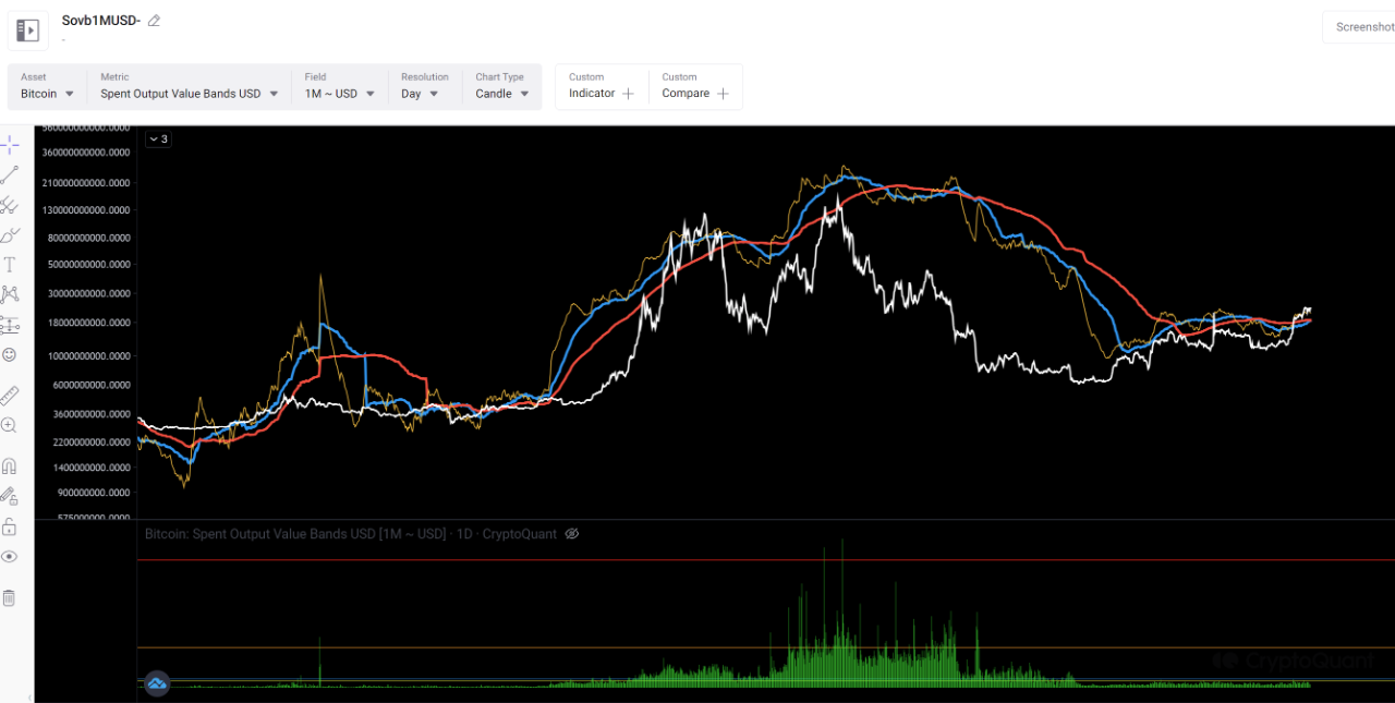
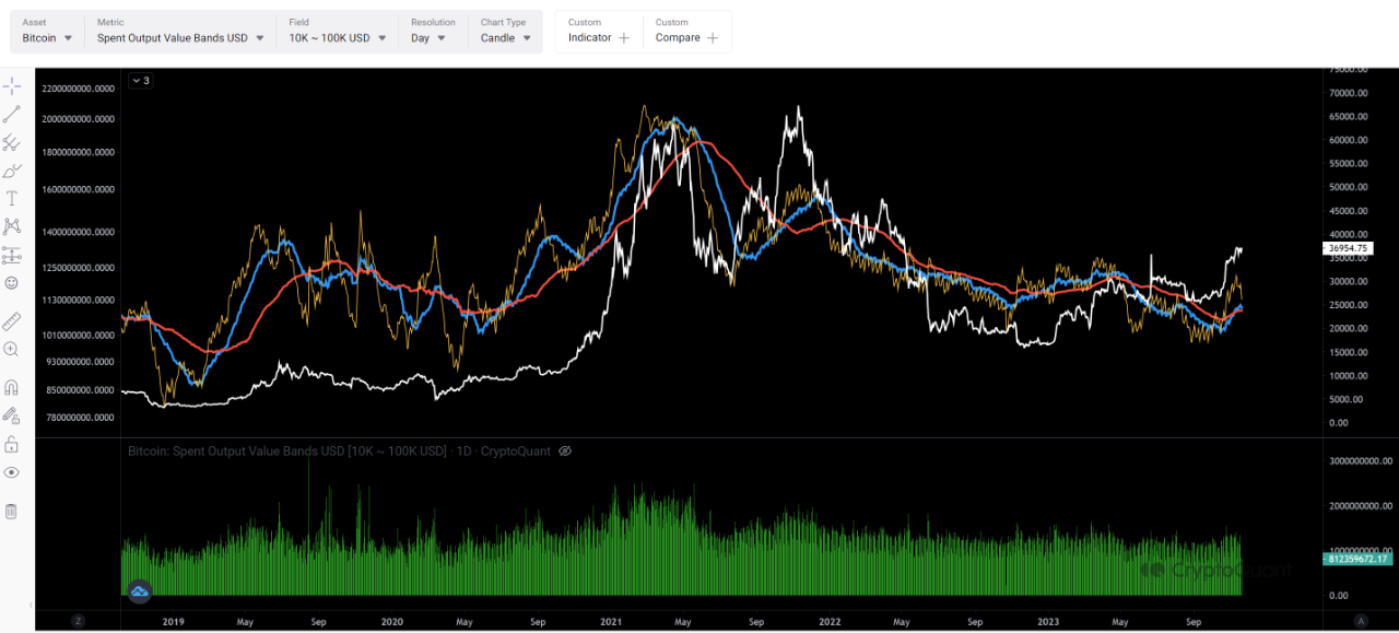
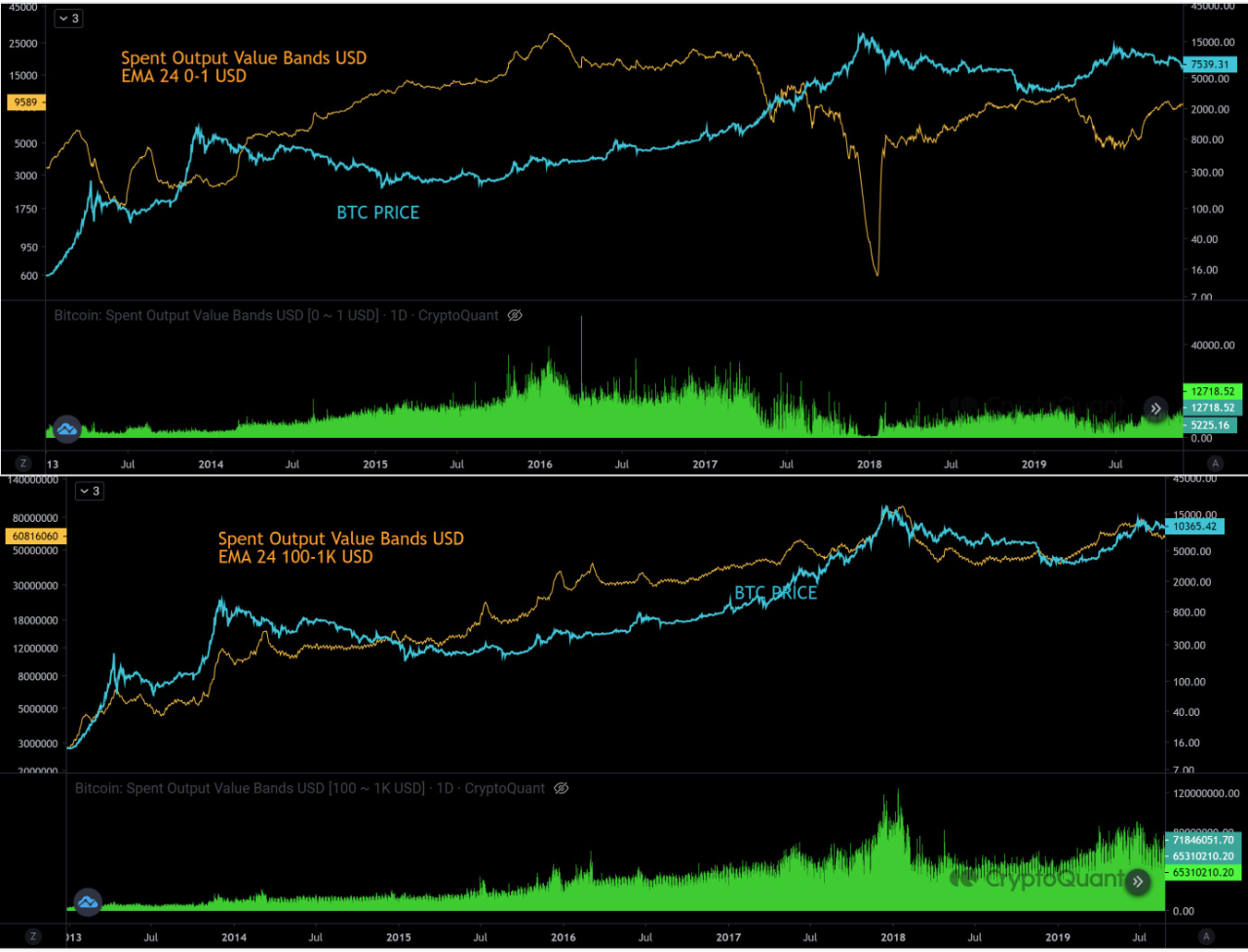
View original →Spent Output Value Band can be used to estimate the amount of coins moved by whales and retail holders.
The first image is a little difficult to understand, so I have used EMA for the short-term line and two SMA for the medium- to long-term line to illustrate the changes by market participant in an easy-to-understand manner.
It is worth noting that the blue line is about to intersect the red line exactly. We note that the use of real thresholds will further increase trading activity in whales (1M).
The yellow horizontal real threshold was exceeded by whale trading activity for the first time on October 25.
At the same time, the short-term line (note: EMA) golden crossed the SMA, and all that remained was to wait for the blue line to golden cross the red line.
Ⅰ has analyzed the retail market from 10Kusd up as the one that made the initial move of the bull run in the first half of this year, and has been monitoring its trend and planning his trading strategy.
After the divergence of the weekly RSI of the bitcoin price, this band also entered profit-taking mode, and the divergence between derivative positions and this band may have led to a price adjustment.
(By all means, if you have any knowledge of this metric, I would appreciate your input)
(We would love to hear your thoughts on this metric.)
Then, with the positive fundamentals for bitcoin, institutional investors are coming back in.
Ⅰ will continue to monitor this indicator to see how far institutional investors in this band will go in bitcoin.

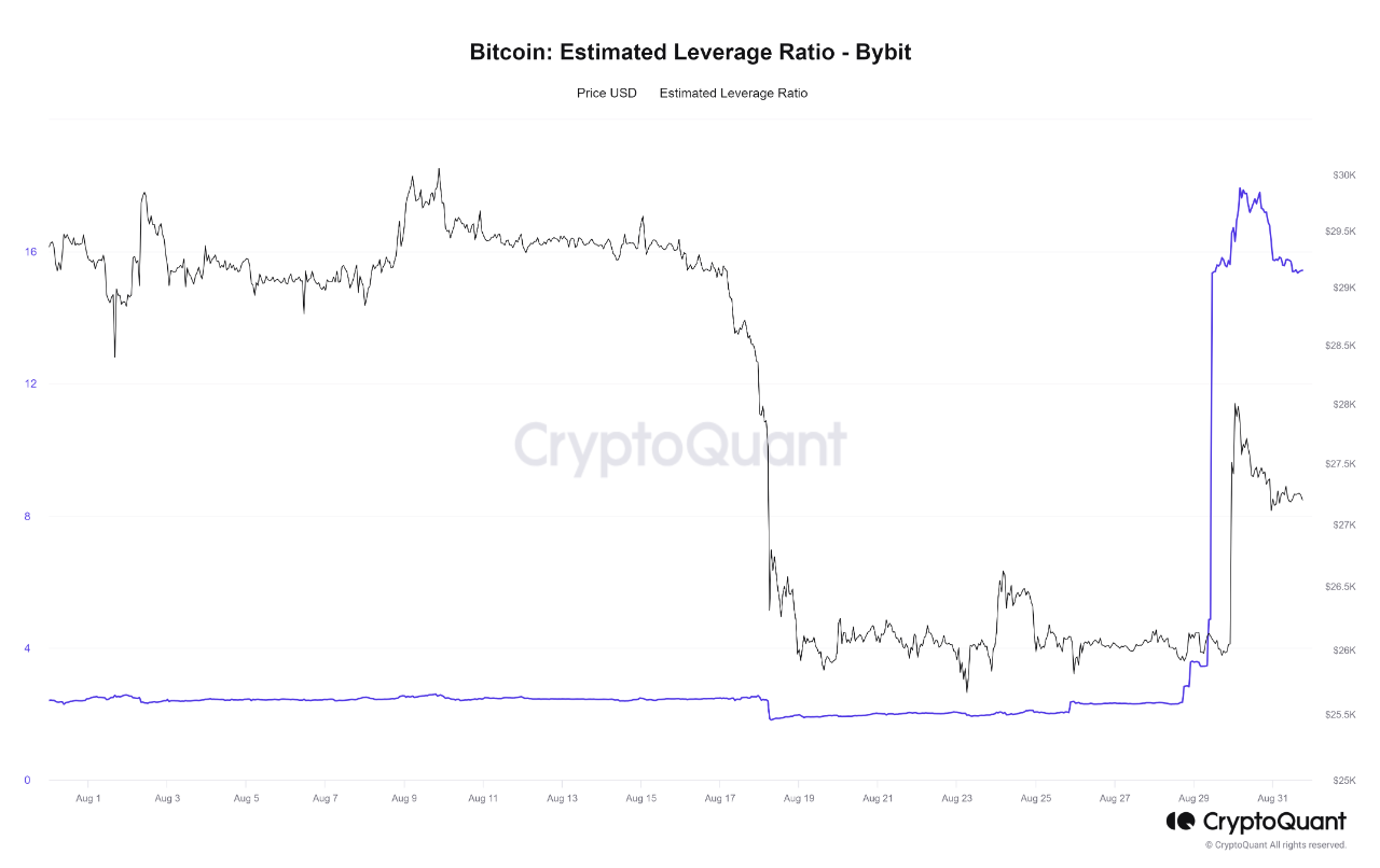
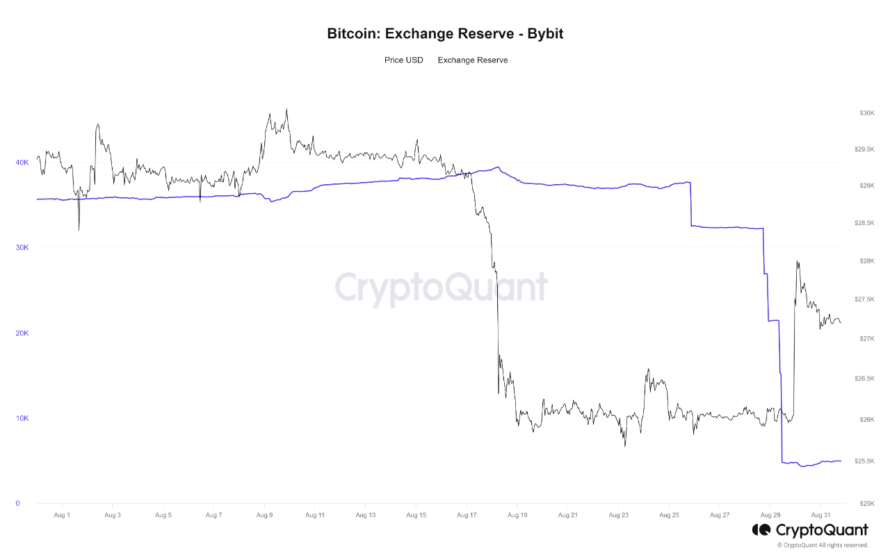
View original →Before Grayscale's victory in spot bitcoin ETF case, Bybit's Whale has done actions move BTC to one address. I don't know why but it is clear it has done before reveal the Grayscale's good news.
We know next target is 2th Sep,”BlackRock”.
As a side note, I usually use a Bybit Estimated leverage ratio of over 2.5 as a criterion for determining whether retail derivatives are overheated or not. In this case, the whale movement preceded the price rise, but in the absence of strong fundamentals, the Bybit Estimated leverage Ratio will support my judgment as to which way their positions are skewed when the ratio exceeds 2.5, and which way their liquidation is likely to go in terms of Funding Rate and Opne Interest.

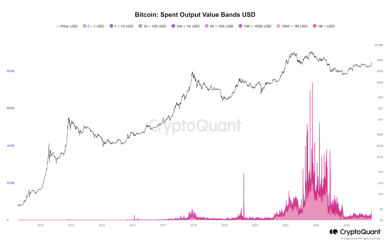
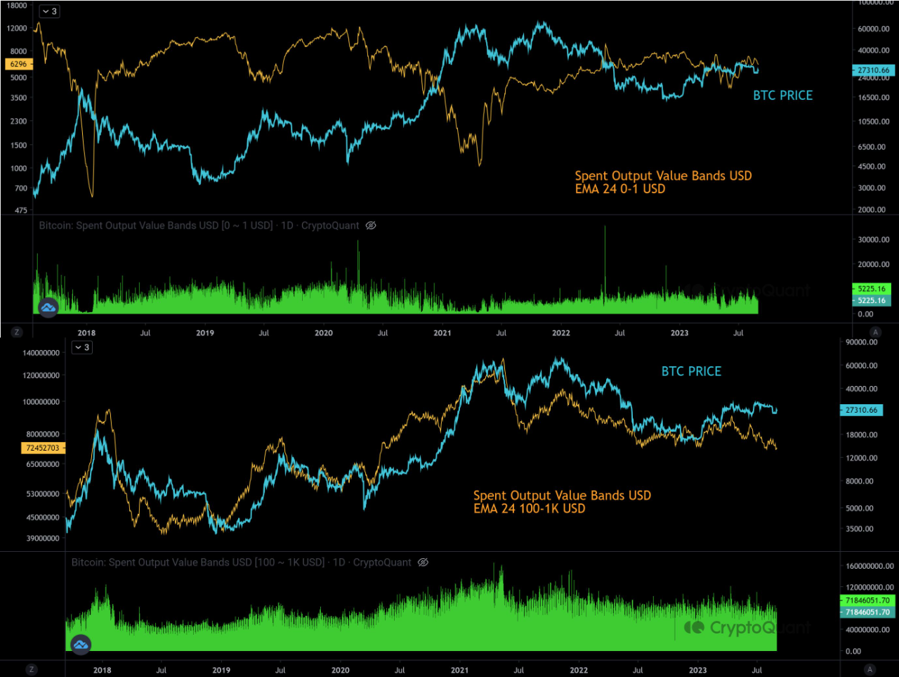
View original →Spent Output Value Bands show the distribution of all spent outputs according to its value.
It can be read from this image that the movements of whales and retailers are clearly correlated and inversely correlated with the BTC price. The Value Band we examined this time is in the 100-1KUSD range, so it is a bit misleading to call it a whale, but it is the one that shows the most positive correlation with BTC prices among the several Bands.
According to this verification, the 100-1KUSD BAND is currently bearish, indicating that the market has no momentum. Unless this point turns upward, prices will likely be transitory. Also, 0-1USD is still pointing upward compared to the previous rise (most recently downward), so hopefully this will start to turn bullish in the overall trend. Currently, both BANDs suggest that the BTC price may only be on a transitory rise.

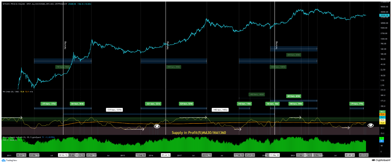
View original →From Supply in Profit (%), I tried to decipher from the data the temporal psychology of those who are aware of Bitcoin'halving' and where we are now, once and for all.
In conclusion, I believe we are at the eye icon mark. This prochart shows the average number of days from Bitcoin'halving' to next Bitcoin'halving', 1360 days average and 30 days average, based on the past three Bitcoin'halving' periods and their duration. Currently, the 1360 MA and 30 MA have just dead-crossed. The Supply in Profit (%) has not reached 80% or more since the last phase of the bear market, when the Supply in Profit (%) exceeded the 55% zone. Similar market conditions in the past were more similar to the current phase yard environment in 2016.
Assuming that the market environment is the same as in 2016, the scenario is not a big rise and a big fall, but rather a certain range with a time adjustment before the price finally begins to rise in 2024, with a half-life in mind. The scenario of a price increase with a half-life in mind starting in 2024 after a certain range of time adjustment is also possible.

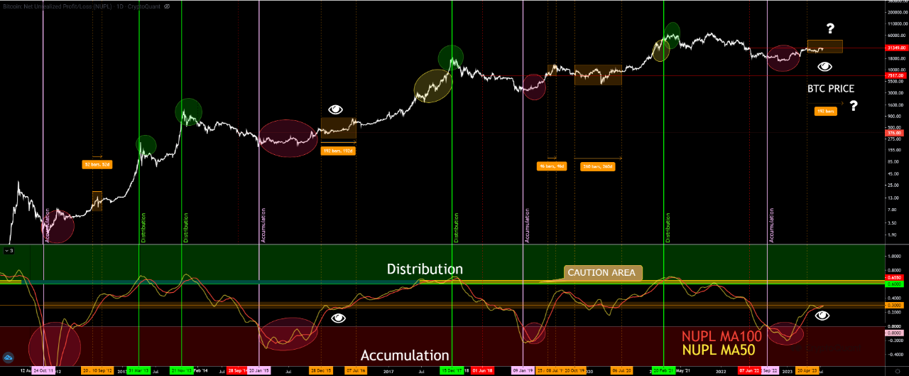
View original →This is a continuation of the report on the accumulation and distribution of NUPL cycles.
In the previous report, at MA100 of the NUPL
The threshold for distribution is greater than 0.6
The accumulation threshold was defined as 0 or less than 0
and NUPLMA100 has now reached the middle 0.3 of the cycle.
This time, I added NUPLMA50, and the period of time it took for MA50 to enter 0.25 and MA100 to exit 0.35, and the BTC price movement during that period.
The characteristics of bitcoin's price movement during that period are shown in orange rectangles as well as a red horizontal line on the price of bitcoin when NUPLMA100 dc'd with NUPL0.35.
The red horizontal line is added to the BTC price when NUPLMA100 dc's with NUPL0.35.
Unfortunately, the sample size is small, which means that there is not much to compare,
The price movements in this intermediate zone are characterized by
A sharp drop from a sharp rise if the market momentum is strong,
When the market has been struggling for a long period of time, the price rises sharply after repeatedly confirming the support price.
The NUPLMA100/50 is the first price to fall.
The zone of NUPLMA100/50 at NUPL 0.25-0.35 is the most similar to Bitcoin's historical move from
2015-2016 is similar.
Will 2023 repeat the same price movements as 2015-2016?

View original →

