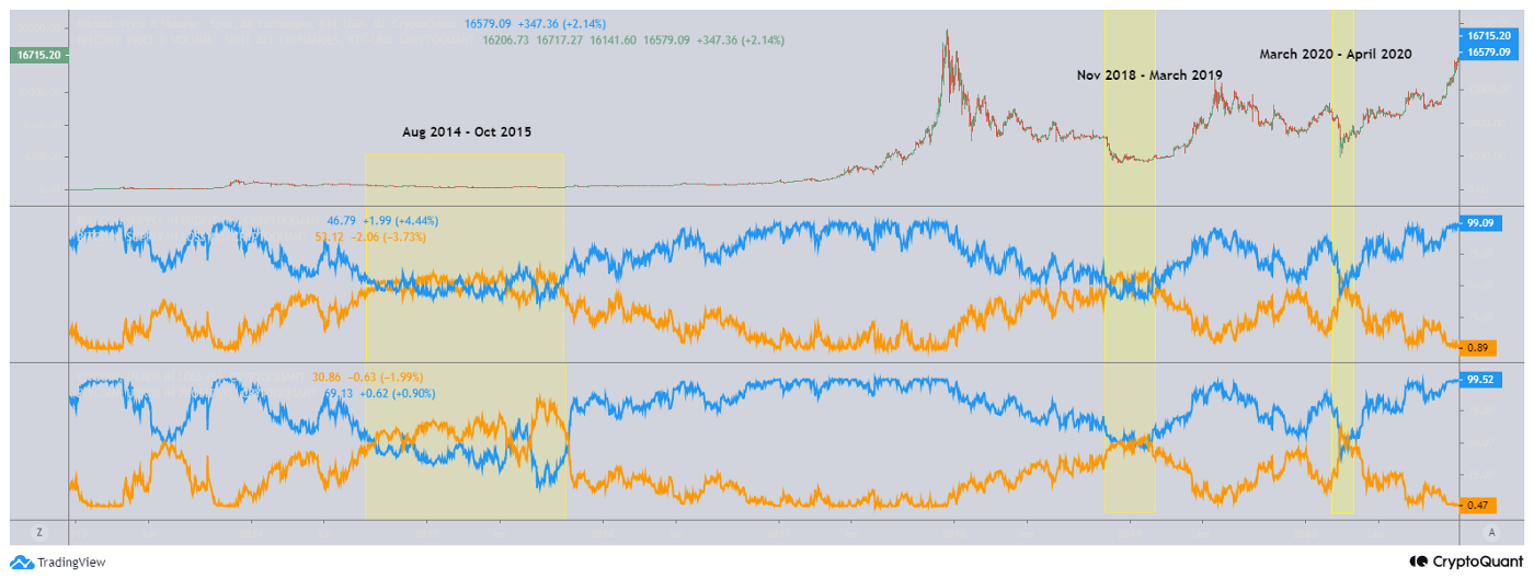
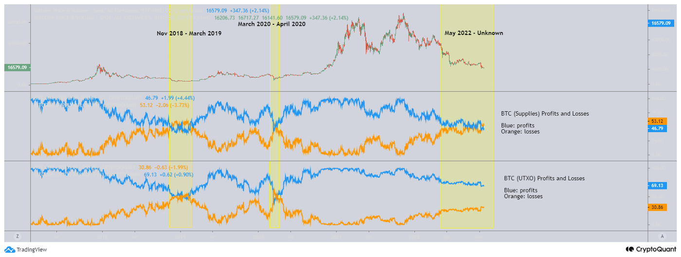
I highlighted 4 periods in the first 2 charts.
- Aug 2014 - Oct 2015, 14 month period
- Nov 2018 – Mar 2019, 5-month period
- Mar 2020 – Apr 2020, 1-month period
- May 2022 – Current, 7-month period and ongoing
These periods are where the percentage of supplies in profit drops and the percentage of supplies in losses increases. Both the percentage of supplies in profit and losses comes to a point where the meet and overlapped when using the 2 metrics together as identified by the yellow box.
Normally periods like this has shown historically that Bitcoin's price is an attractive price level.
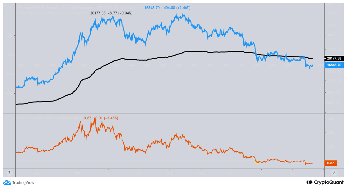
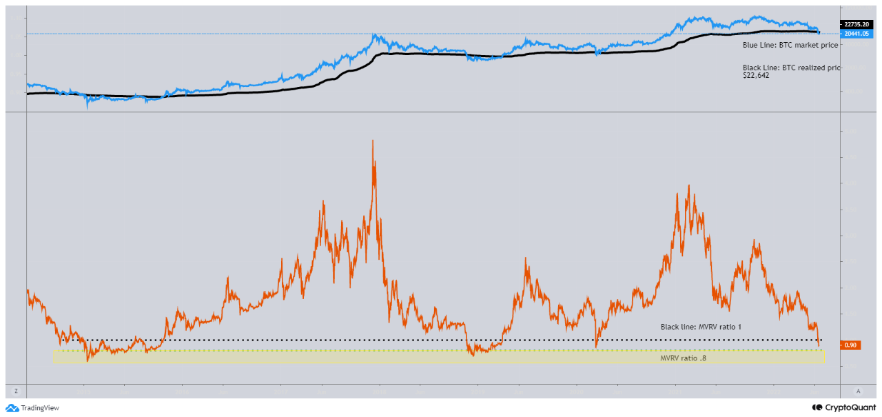
The 3rd chart is looking at realized price and the MVRV. Currently, the MVRV has been quite low and less than a 1:1 ratio. This tells me that the current price is 18% less than the average market bought price.
These charts does not indicate that BTC's price cannot drop but instead it shows a period of time where Bitcoin's price historically has seen its market bottoms.

View original →Bearish(Nuanced)BTC
7/7/2022 It's an important time to manage risk.
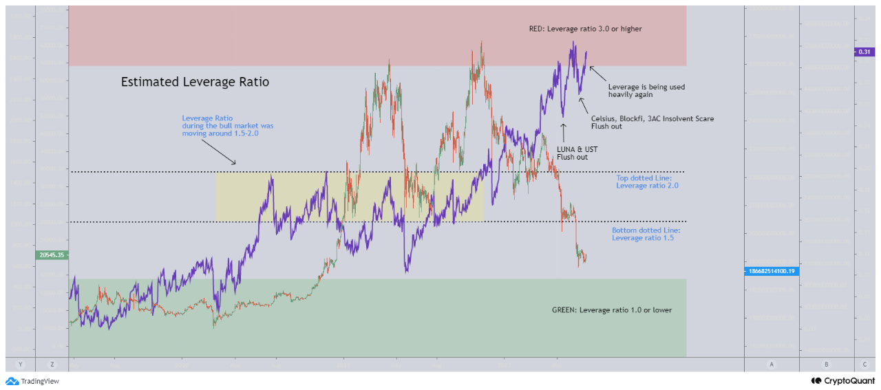
The Estimated Leverage Ratio during the bear market was often lower than 1.0.
When the markets started rallying towards the 2nd half of 2020 and onto the end of 2021, the Est. Leverage Ratio was moving around 1.2 - 2.0.
I marked the bottom dotted line marked at 1.5 since that's the range I personally would like the market to fall back into.
Recently, we seen leverage ratio hitting 3.0 and higher. A ratio of 3.0 is considered really high.
We've seen a flush out during the LUNA & UST crash, but this was followed by more leverage being taken.
And this was then followed up again with another flush out during the Celsius, Blockfi, 3AC insolvent news.
However, we are seeing leverage ratio moving up again.
I personally believe that institutions and retail are taking leverage positions to cover losses.
The question is... what will the market look like if we get a flush out all the way down to somewhere between 1.5 and 2.0? or even lower?

View original →MVRV measures the market value over realized value.
Realized value is the average market purchased price.
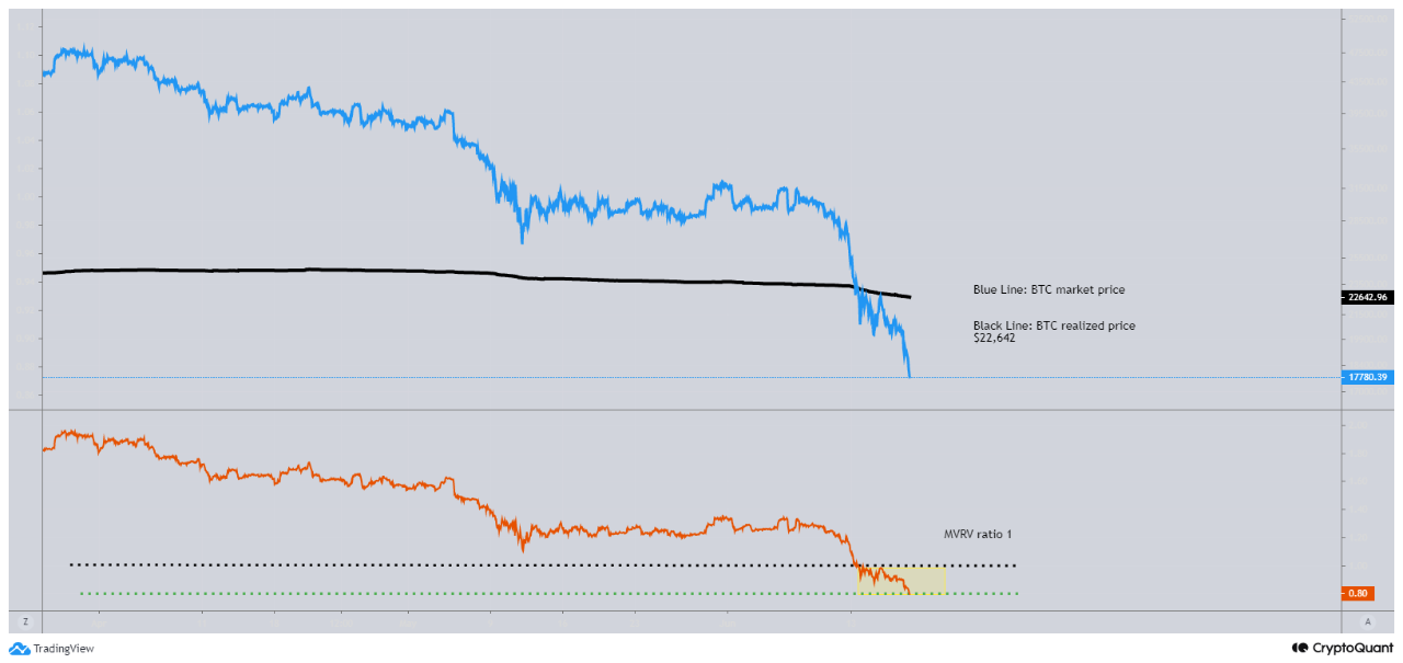
Today, the MVRV hit 0.8 on the hourly chart shown in the first chart.
MVRV is not 0.8 on the daily yet.
Historically, there are VERY few periods of time where BTC can be accumulated at this level.
MVRV at 0.8 means that the market price is at approximately 20% below the average market purchased price.

View original →MVRV measures the market value over realized value.
Realized value is the average market purchased price.
Today, the MVRV hit 0.8 on the hourly chart shown in the first chart.
MVRV is not 0.8 on the daily yet.
Historically, there are VERY few periods of time where BTC can be accumulated at this level.
MVRV at 0.8 means that the market price is at approximately 20% below the average market purchased price.



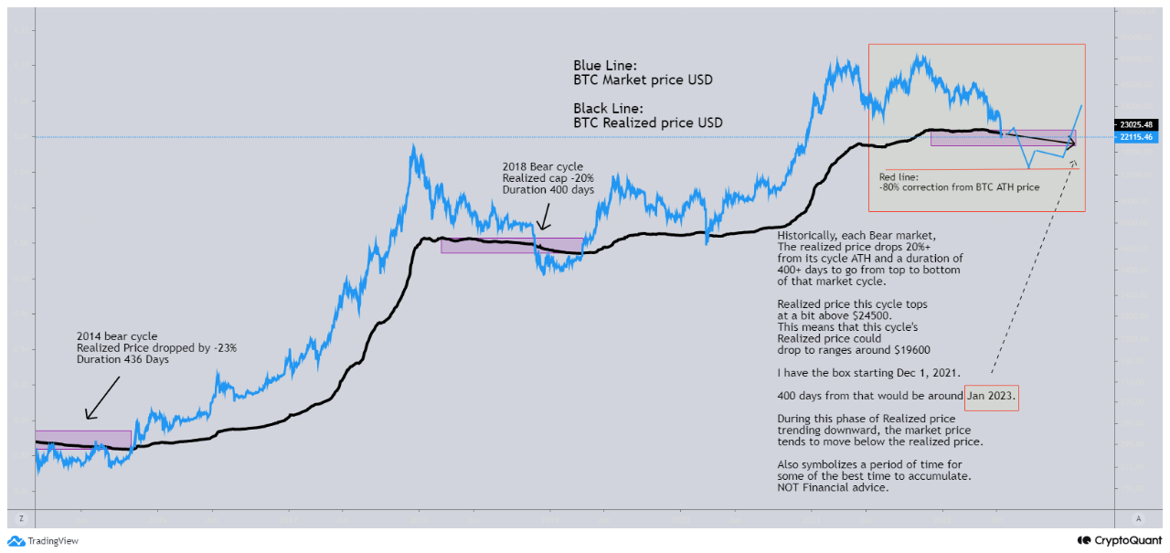
View original →Realized price is NEVER the same. The average purchase price changes based on the market price.
Historically, there's around a -20% drop in from Bitcoin's Realized price from its cycle's ATH to that same cycle's ATL. This period lasts a duration of around 400 days.
The ATH for this market cycle's BTC Realized price is a little above $24500. Currently, the Realized price is $23000. A -20% drop from $24500 would put Realized price at around $19600 for the realized price cycle bottom.
Typically, during the period of time where Realized price trends downward, the market price of Bitcoin also drops and moves below the Realized price.
The MVRV ratio that is not in the chart will be less than 1 ratio. Lower MVRV ratio means mkt price is below realized price/purchased price.
The yellow box is my prediction for mkt price movement.
*prediction is not Financial advice. *
However, Mkt price is already moving below Realized price, and we'll probably move below Realized price for a while.

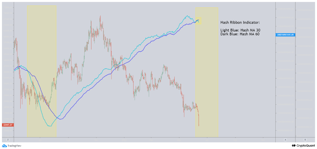
View original →The Hash Ribbon indicator haven't cross since May 2021.
Hash Ribbon indicator looks at potential period where Bitcoin Miner struggles to support the Bitcoin network. When this happens, some miners may capitulate, sell to fund operation, or turn some mining rigs off.
This indicator looks at the 30 daily MA dropping below 60 daily MA.
- indicated in the first chart and closer look in the 2nd chart with a stronger yellow box.
The 30 daily MA moving below 60 daily MA will most likely happen for a period of time.
This doesn't indicate the bottom, but it does measure a period of time where Bitcoin's price may look very attractive.
Puell Multiple is low! This indicator on the bottom panel of the first chart looks at Bitcoin miners and their revenue. A low number means that they are not as profitable.
Not financial advice but historically these periods have some of the most attractive Bitcoin prices.


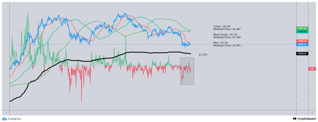
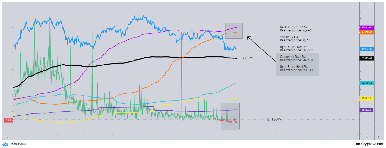
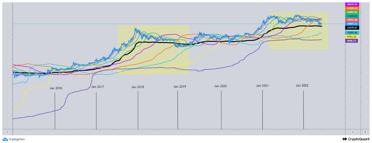
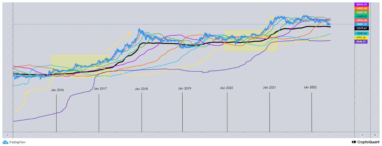
View original →4 Charts:
- Short Term Holders (STH) realized price and STH SOPR
- Long Term Holders (LTH) realized price and LTH SOPR
- Market's Realized price (wide realized price range)
- Market's Realized price (narrow realized price range)
In the 1st chart, we look at STH. Here, we can see that STH that were bought BTC between 1M - 6M, those supplies are in loss.
In the 2nd chart, We look at LTH. Here we can see that LTH supply bought between 6M -18M are in losses. LTH supply bought longer than 18M are still in profit. SOPR for LTH just saw some losses and those are due to supplies within the 6M-18M.
In 3rd chart, we can see that we currently are seeing a wide range of Realized price for all age groups. This is currently the same as the 2018 bear cycle.
In the 4th chart, we see a narrow range of Realized price for all age groups. After, the narrow price range for realized price, the market price of BTC started going parabolic. I believe this needs to happen before the next parabolic run.

View original →Recently, we have seen the BTC taker buy sell ratio start to move upward. This indicates that more buying is occurring. When looking at the daily MA 7 for the Taker buy sell ratio, in the past, when it moves higher than a 1:1 ratio, then the price normally rallies upward.
We're also starting to see the MA 14 and MA 30 for the taker buy sell ratio trend upward. I do not know if this will continue but it is a sign that buying is happening.
Next, we look at the spent output by holders holding between 1 BTC - 10k+ BTC. This supply distribution is responsible for holding 95% of the BTC supply. Recently, spending is starting to trend downward for these groups.
Then finally, looking at inflows and outflows.
Both inflows and outflows have started to also trend downward.
What's important is measuring sell pressure.
Less inflows, less spending = less sell pressure.
Taker buy sell ratio is trending upward = more buy pressure.
potential near short term price rally? we will have to see

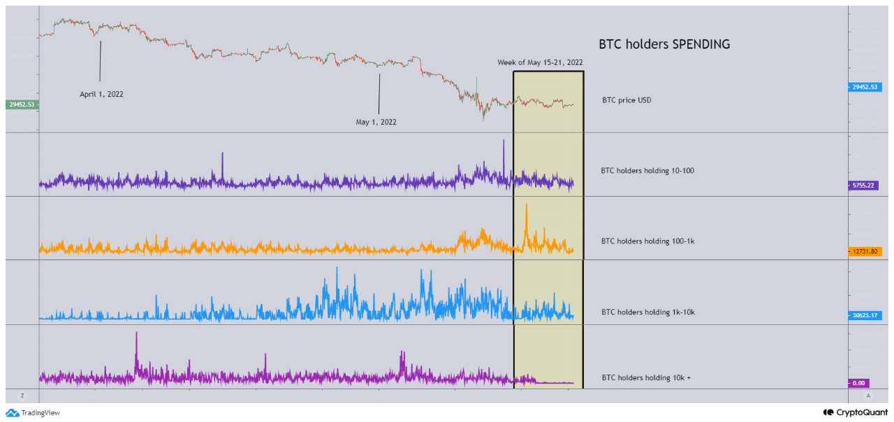
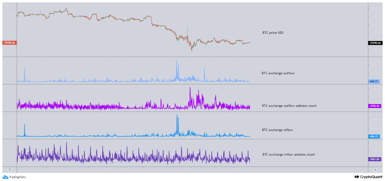

View original → HUGE BTC exchange inflowing
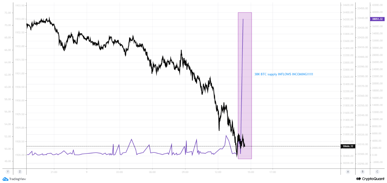
This is 38K BTC supplies INFLOWS INCOMING!!!!!
Worth over $1.2 USD Billion
Sometimes, inflows will sit on an exchange, sometimes there will be an outflow meaning it's transferred back out and sometimes the Inflows are sold.
Should we expect sell pressure increasing even more?

View original →Quick and simple,
We're seeing larger holders spend their BTC.
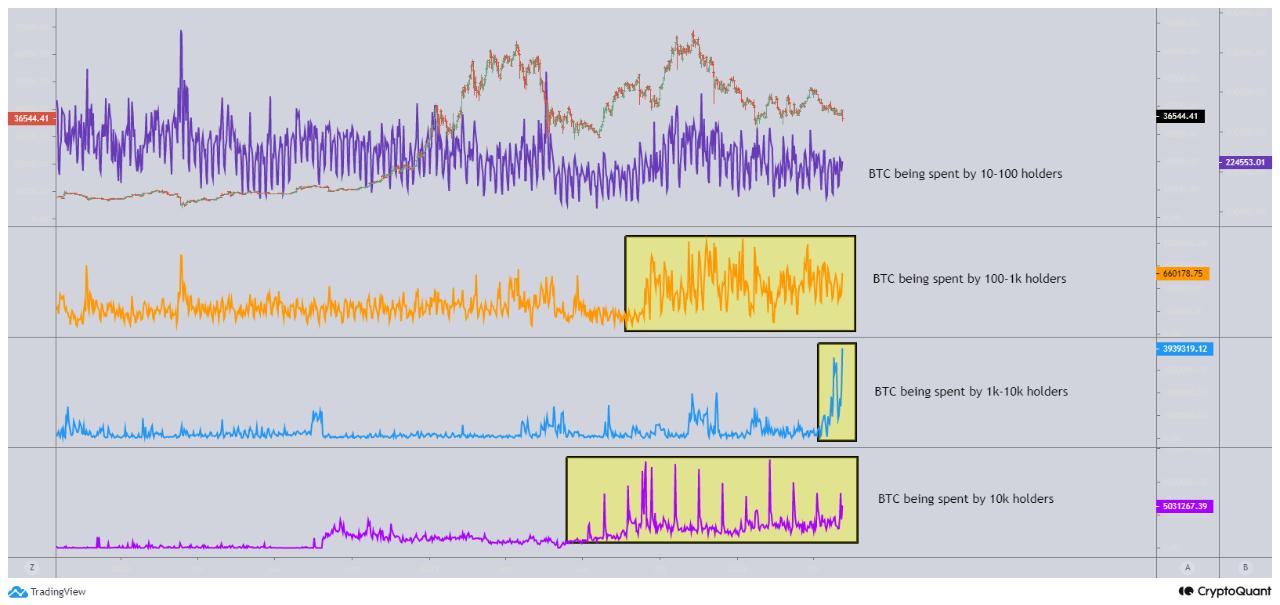

View original →

