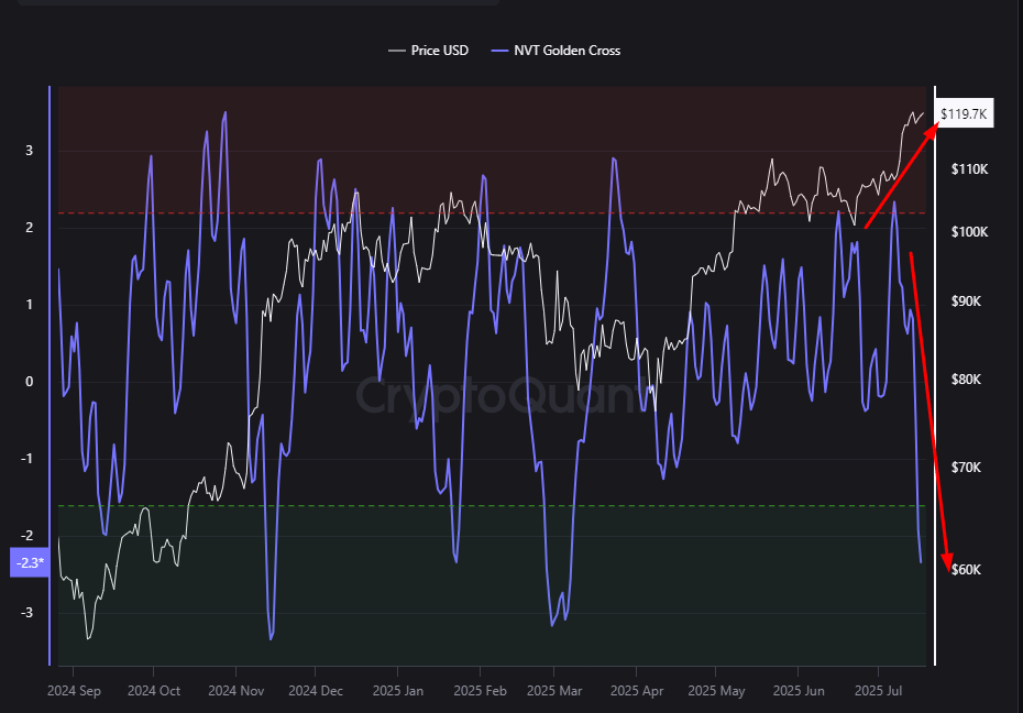
Bitcoin's price is on the rise, yet the NVT Golden Cross indicator is surprisingly moving downward. Typically, as prices rise, the NVT ratio is expected to move upward since it measures the relationship between network transactions and market value. However, the current decline in NVT during a price increase indicates a stronger and faster-than-expected growth in Bitcoin's on-chain transaction volume.
This situation can be viewed positively by investors, suggesting that the price increase is supported by genuine economic activity rather than mere speculation. In other words, real users and actual financial transactions on the network are making this uptrend more sustainable.
In conclusion, the current rise in BTC indicates a healthy market built on strong fundamentals. Such movements often point toward more lasting and stable long-term growth. Investors should closely monitor these indicators to better understand market trends.

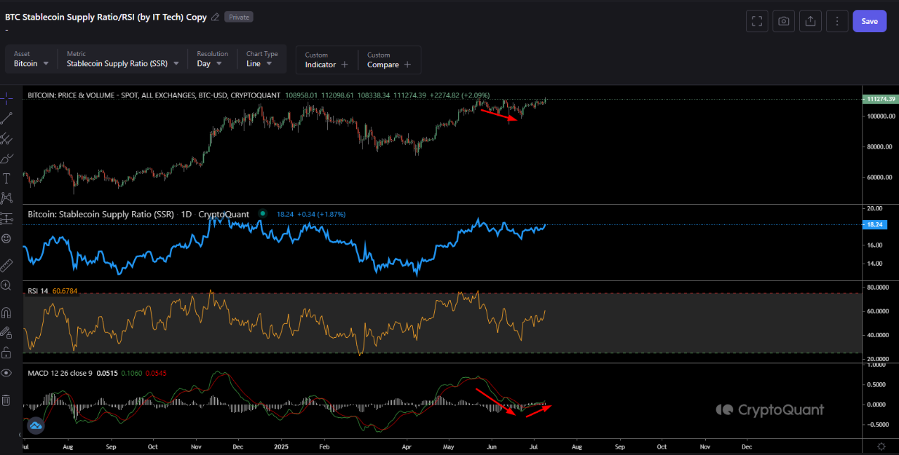
View original →As Bitcoin presses against the $111 000 band, market optimism is mounting, and the data layer just served up an encouraging sign: a bullish crossover in the Stablecoin Supply Ratio (SSR) MACD. SSR gauges the market’s available “dry powder” by dividing Bitcoin’s market cap by the total stable-coin supply; when the ratio rises, fresh buying power is scarce. In recent weeks, SSR has already climbed to 18 —the top of its two-year range. Now the MACD has crossed above its signal line, a move that has historically preceded incoming liquidity and fresh rallies. While price is carving new highs, this “new fuel” signal is promising; still, unless we see expanding volume and SSR cooling back toward the 16–15 zone, the $113–115 k area looks attractive for profit-taking, whereas a weekly close below $99 k should be treated as a stop-loss trigger. Bottom line: a cautious-bull stance remains the most rational strategy in light of the data.

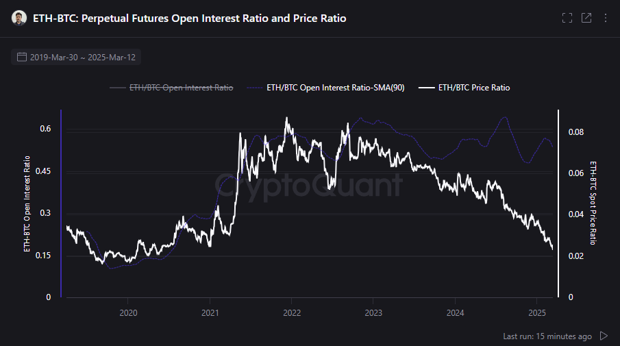
View original →The ETH/BTC market provides an in-depth look at the relationship between Ethereum and Bitcoin, as well as their developments in the derivatives markets. In 2021-2022, Ethereum’s strong performance against Bitcoin reflected increasing speculative interest and high activity in the derivatives market. During this period, Ethereum’s rise against Bitcoin was a clear signal of growing investor confidence in Ethereum.
However, since 2023, both the open interest and price ratios have been on a downward trend, indicating that Ethereum has weakened against Bitcoin and interest in Ethereum in the perpetual futures market has declined. This points to a long-term depreciation in Ethereum’s value. By March 2025, the open interest ratio had fallen to 0.15 and the price ratio to 0.02, indicating that bearish sentiment dominates the ETH/BTC pair, with Ethereum losing significant value against Bitcoin.
However, this decline could also be a sign of fear and uncertainty in the market. During such periods, where human emotions take over, recoveries can be rapid and surprising, especially in assets with low liquidity. Although interest in Ethereum has decreased for now, there is potential for a return to the conditions seen in 2021-2022, with a strong and sudden recovery that may surprise many.
This process may present opportunities for Ethereum’s future. Emotional fluctuations and market fear could lead investors to act more cautiously and strategically. We may be at the foundations of new beginnings for Ethereum; just like in previous cycles, after tough times, a strong rebound may occur, reaching new highs.
Looking at the price fluctuations in Ethereum, now could be the perfect time to be part of this transformative process. We are at the bottom of potential new beginnings and opportunities for ETH.

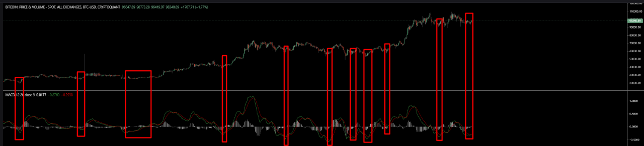
View original →The BTC Stablecoin Supply Ratio (SSR) MACD is a powerful tool for analyzing Bitcoin’s price dynamics, helping to understand market sentiment and momentum. SSR measures the ratio of stablecoin supply to Bitcoin supply, reflecting investors’ risk appetite and liquidity flows. An increase in SSR indicates BTC selling pressure, while a decrease suggests buying pressure. MACD analyzes the difference between fast and slow moving averages to identify trend changes, with crossovers clarifying these shifts.
Bullish crossovers (when the MACD line crosses above the signal line) signal upward (bullish) momentum. For example, as BTC’s price rose from 60,000 USD to nearly 100,000 USD, SSR MACD moving above the zero line indicated a strong upward trend. This reflects buying pressure from converting stablecoins to BTC. Investors may view these crossovers as buying opportunities, but they should be confirmed with volume, RSI, and support-resistance levels like other technical indicators.
Bearish crossovers (when the MACD line crosses below the signal line) indicate downward (bearish) momentum. When BTC fluctuated between 20,000–30,000 USD, SSR MACD dropping into negative territory signaled a downward trend. This reflects a shift to stablecoins and selling pressure, which can be evaluated as a potential sell signal for risk management.
While crossovers provide clear price movements, decisions should not rely solely on this data. They should be supported by fundamental analysis (news, regulations), volume data, and technical indicators, with risk minimized through strategies like stop-loss. When used correctly, SSR MACD can guide Bitcoin trend forecasting, but market volatility must always be considered.

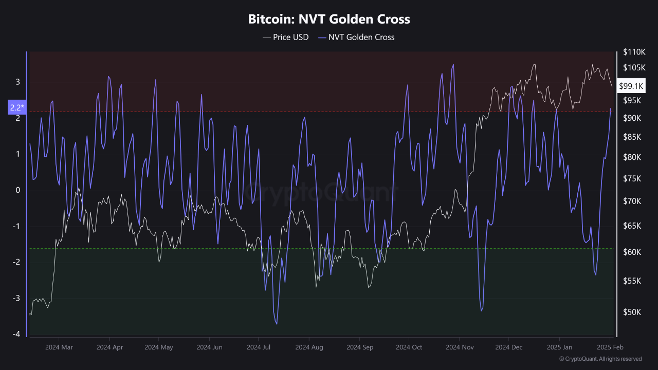
View original →NVT is a metric that compares Bitcoin’s price to its blockchain transaction volume. It can be seen as a test to determine whether Bitcoin is “overpriced or undervalued.” The Golden Cross, on the other hand, refers to a scenario where this indicator merges with certain moving averages to provide critical signals for investors.
The NVT Golden Cross helps answer the question, “Is Bitcoin’s price above its fair value, or is it an attractive investment opportunity?” When the blue line rises above 2, it signals that Bitcoin’s price might be “overheated” and could pose a bubble risk. Conversely, when the line drops below -2, it is often considered a “buying opportunity.”
The key takeaway in the current situation is to avoid making emotional decisions. With the blue line surpassing the critical threshold, adopting a cautious approach is advisable. However, it’s essential to remember that this indicator is just one tool. Every investor should conduct their own analysis and take steps aligned with their risk tolerance.
Always bear in mind that assets like Bitcoin are highly volatile and carry significant risks. Being informed and patient remains your best guide to long-term success.

View original →When we look at Bitcoin's pullbacks, a fascinating pattern emerges! What happens in those red-marked zones? The market takes a dive into the "bear zone," and it feels like all hope is lost. But this is exactly where the magic begins!
In these bear zones, short-term patience becomes a golden opportunity for investors. History shows us that after these quiet periods, Bitcoin tends to make much stronger upward moves. Instead of panicking, those who hold steady during these times are often the ones rewarded when the market bounces back.
The chart makes this clear: after every major pullback, the market pauses, takes a breath, and then enters a stronger upward trend. These patterns highlight the importance of market psychology and the power of patience.
The takeaway is simple: if you can read Bitcoin’s ups and downs, pullbacks don’t have to be scary—they can be opportunities. While red zones might initially seem discouraging, history proves that the rebounds from these levels are often far more impressive. Patience wins!

View original →Bullish(Nuanced)BTC
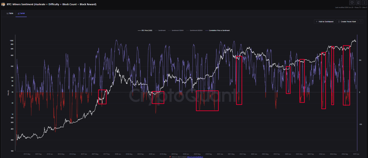
1/3/2025 The chart illustrates the relationship between Bitcoin (BTC) miner sentiment (hashrate, difficulty, block count, and block reward) and BTC price movements.
🔍 Key Observations:
The red boxes highlight periods when miner sentiment sharply turned negative, followed by significant BTC price movements. These points often coincide with market bottoms or the beginnings of upward trends.
📊 Key Findings:
Mid-2017 and Late 2018: Negative miner sentiment zones triggered price recovery movements.
March 2020: After a sharp pandemic-driven drop, miner sentiment stayed negative while prices rebounded rapidly.
2021 and Beyond: During bull markets, sentiment indicators frequently fluctuated, with major negative deviations supporting short-term corrections and price increases.
2023 and 2024: Recent periods show increased sentiment volatility, indicating high market fluctuations influenced by miner behavior.
💡 Summary:
Declines in miner sentiment often signal potential bottoms in BTC prices. This chart suggests that investors can identify buying opportunities by closely monitoring miner sentiment data.

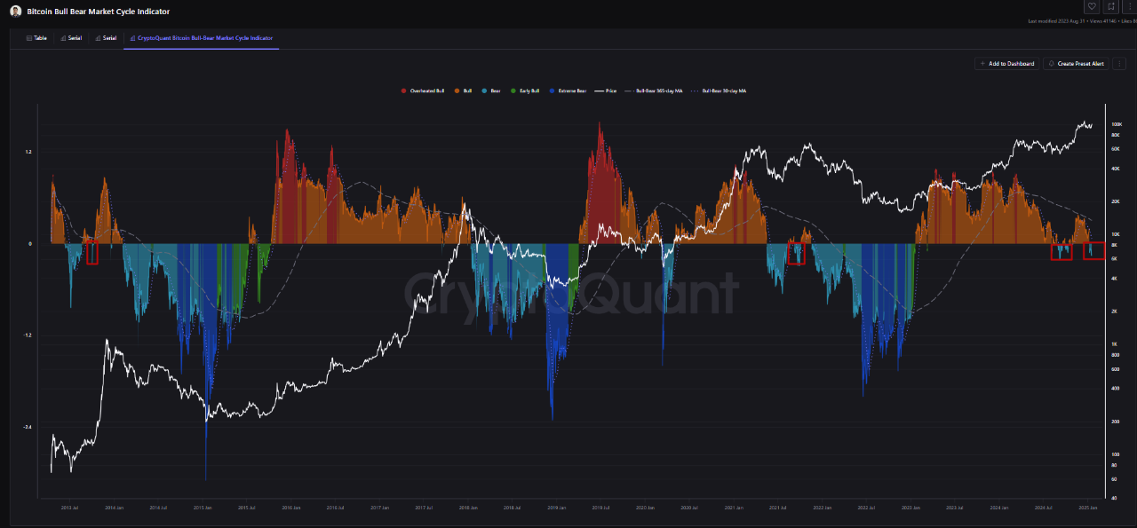
View original →The Bitcoin market has been fluctuating between bull and bear cycles for years, offering various opportunities to investors. In this process, the Bitcoin Bull-Bear Market Cycle Indicator has become a critical tool for understanding the current state of the market and its potential direction. According to recent data, Bitcoin is currently within the bull market (Orange Zone), where the upward trend is dominant.
This indicates that prices are moving upwards but have not yet reached their peak. For the transition to the peak period, the short-term 30-day Bull-Bear Market Cycle Indicator moving average needs to cross above the long-term 365-day Bull-Bear Market Cycle Indicator moving average. This crossover could signal a stronger bullish trend and increase the likelihood of prices reaching higher levels.
As long as the 30-day Bull-Bear Market Cycle Indicator moving average remains above the 365-day Bull-Bear Market Cycle Indicator moving average, the long-term outlook will stay positive. However, as prices approach the red zone, the risk of corrections may increase. Therefore, it is crucial for investors to remain cautious during this period and consider taking profits when necessary.
Although the current bull market shows strong momentum, it is vital to take market fluctuations into account and monitor price movements strategically. Following critical signals such as the crossover of moving averages can help investors identify opportunities more effectively during this period.


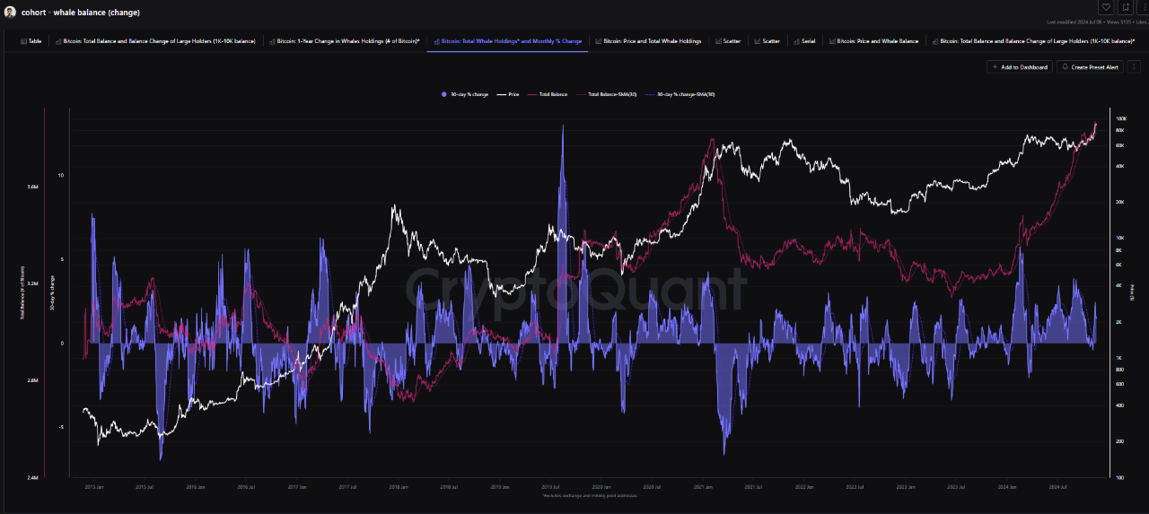
View original →In the cryptocurrency market, large-scale investors known as "whales" play a critical role in Bitcoin price movements. Addresses holding between 1,000 and 10,000 BTC are key indicators of market trends, making their behavior essential for predicting price directions.
According to recent data, whales continue to accumulate Bitcoin. The positive 30-day percentage change stands out as one of the key metrics supporting this accumulation. Furthermore, the correlation between Bitcoin’s price and whale balances highlights the growing dominance of these investors in the market.
Whale Accumulation and Its Impact on Price Whales accumulating Bitcoin is seen as a significant signal of an upward price trend. It indicates a period of market confidence and sufficient liquidity. Additionally, the 30-day Simple Moving Average (SMA30) helps analyze the long-term tendencies of whale behavior. A positive slope in the moving average suggests potential for upward price momentum.
Risks and Opportunities: Navigating the Cycle The whale accumulation process not only drives prices upward but also sustains gradual gains over time. However, consistent buying by whales may eventually lead to risks. Accumulated Bitcoins will inevitably be sold, which could create selling pressure and sharp price declines.
Thus, monitoring whale accumulation and selling cycles is critical. Understanding the current market phase and timing exits correctly are key success factors for investors.

View original →The UTXO Block P/L Count Ratio Model is a significant tool for understanding Bitcoin's price cycles and the profit/loss balance of market participants, offering insights into market health and potential price reversals. This model examines the moving averages of Bitcoin's profitability and loss ratios, revealing the relationship with price movements.
In the chart, moving averages are designed for short (7-day), medium (30-day), and long (365-day) terms, reflecting periodic trends in profit and loss and clarifying the impact of price movements on the profit/loss balance. This analysis provides different perspectives for long-term investors and short-term speculators.
Areas marked by white squares indicate periods with similar trends in the past. An important observation is the decline in profitability ratios over the years, suggesting that short- and medium-term trading strategies are becoming increasingly relevant.
Furthermore, if the 30-day profit and loss ratio exceeds the 365-day moving average, it could signal the formation of a new peak. Despite the varying economic conditions between 2021 and 2022, there is a possibility that the profit and loss ratio will use the annual average as a resistance point for a new peak. Should the profit and loss average remain above the annual average, the likelihood of seeing new highs could increase.


View original →

